Meet NeverMind - Typeface Originally Designed and Presented by XMind
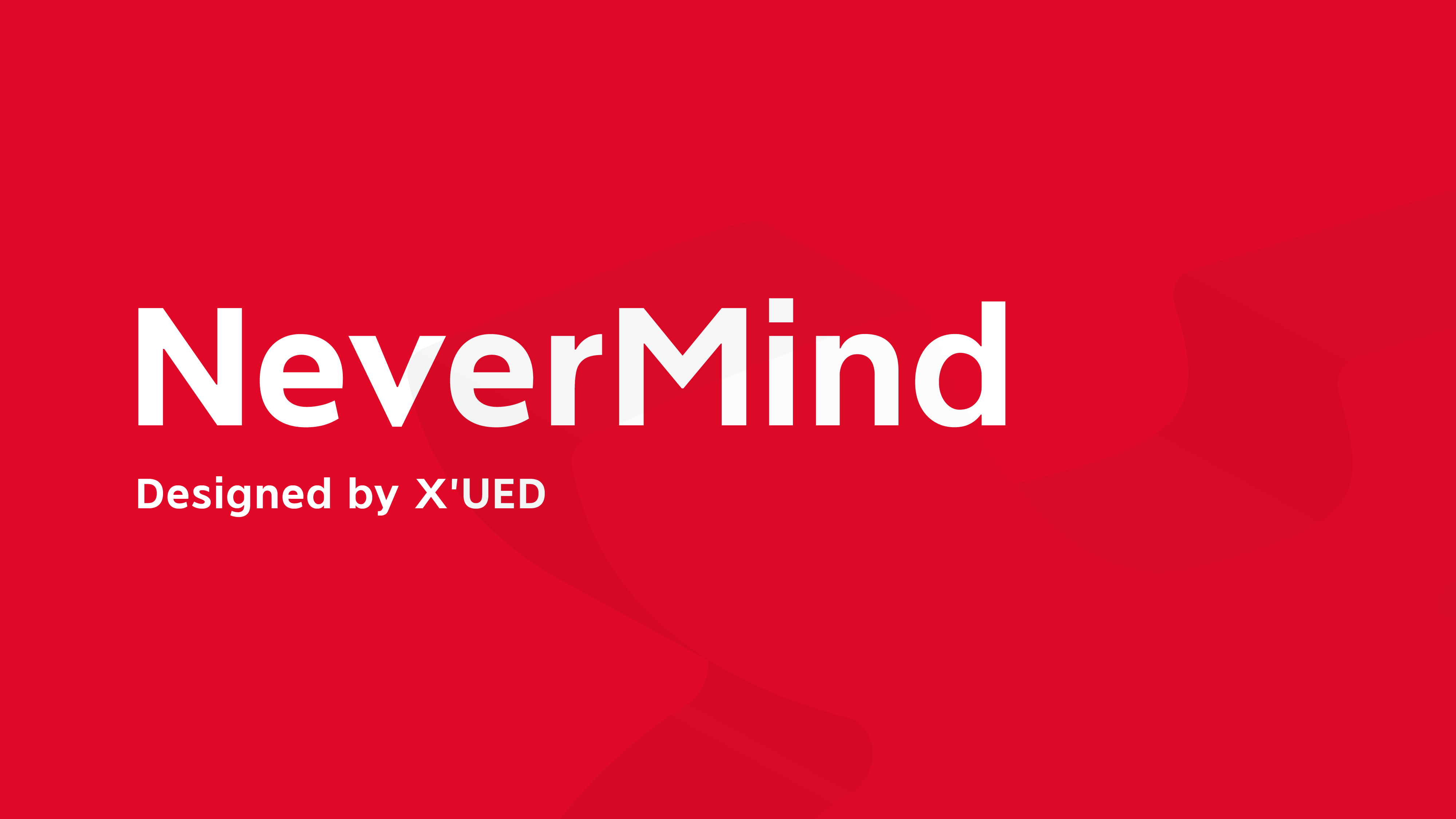
Meet NeverMind - Typeface Originally Designed and Presented by XMind
We endeavor to bring out the best mind mapping and brainstorming tool, but this time, we want to make a challenge - upgrade your reading experience.
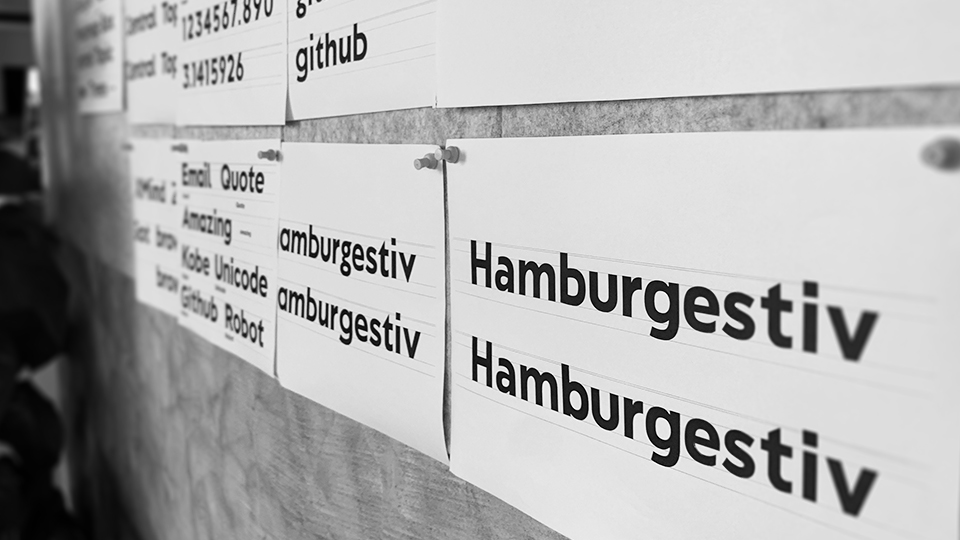
Introducing NeverMind, originally and proudly presented by the XMind team. Covering languages spoken in 40 countries, numbers and punctuation, NeverMind is a San-Serif font built with Geometric and Humanistic.
We did a little talk with the leading designer of the NeverMind project, Lan, approaching to the backstage and diving into his world of designing.
Why do we create NeverMind?
Font design is crucial.
Font matters to designers. We did an internal research before the project, and most of the team agreed on the significance of the font. In research of the first phase, research benefits designers and improve their capability.
Font design is a trend.
Font is top ranked for Steve Jobs, and later Apple developed and released San Francisco. In the latest iOS 13, fonts replacement is supported. Right now, there are more companies joining to create their own font.
Font is influential, and subtle.
If logo and slogan are applause, fonts is like a whisper at your ears. Though volume is low, it delivers the message. We can hardly recognize the power of font when reading sentences or paragraphs, however, the impact exists and influences gradually. Hence, wrapping branding information into the characters when designing seeks great control and acknowledgement of designing. In other way, help the team to go further on design.
What do you want to convey with the font?
I’d say NeverMind is Geometric and Humanistic.
Speaking of Geometric, NeverMind is a combination of the squares, circles and triangle lines. With structured visual repetition, the fonts are presented neatly.
As for Humanistic, the evidence is holding a pen. NeverMind is like a bridge linking hand-written and machine-typed. The brushstrokes and the finishing touches are carefully customized, so that the reading flow continues without interruption. Reading habits might be neglected or compromised for aesthetic, but NeverMind aims the balance between aesthetic and readability.


What makes NeverMind unique?
It Merges with XMind
Geometric refers to the geometric figures that builds mind map, and the Humanistic refers to the curvy lines that connect mind map smoothly together.
In fact, there are some XMind elements merging with the fonts too.
The general design of the font is coherent with the tilt angle of the XMind logo, carrying out consistent modernity and vitality.

If you paid attention, you can see the dot of the character i is on the top of the XMind logo. The dot symbols central topic and that’s I made it into a square.
There are lots of dot-to-square magic in this font too, such as the comma, the question mark, etc.
Mind map is a combination of graphical pattern, and the line connects them together. Fonts help us to connect with the content. In hand-drawn mind map, we seldom put down a straight line for connection, instead the lines are fluid. That’s why I hope the font shape and its style are flowing too.
Play with the Kerning
Font is filled with characteristics, I believe fonts can be both aesthetic and readable. Besides maintain the consistency with the XMind logo identity, I spent most of the time in kerning, including adjust letter spacing and negative space for the visual balance.

Readability and Legibility
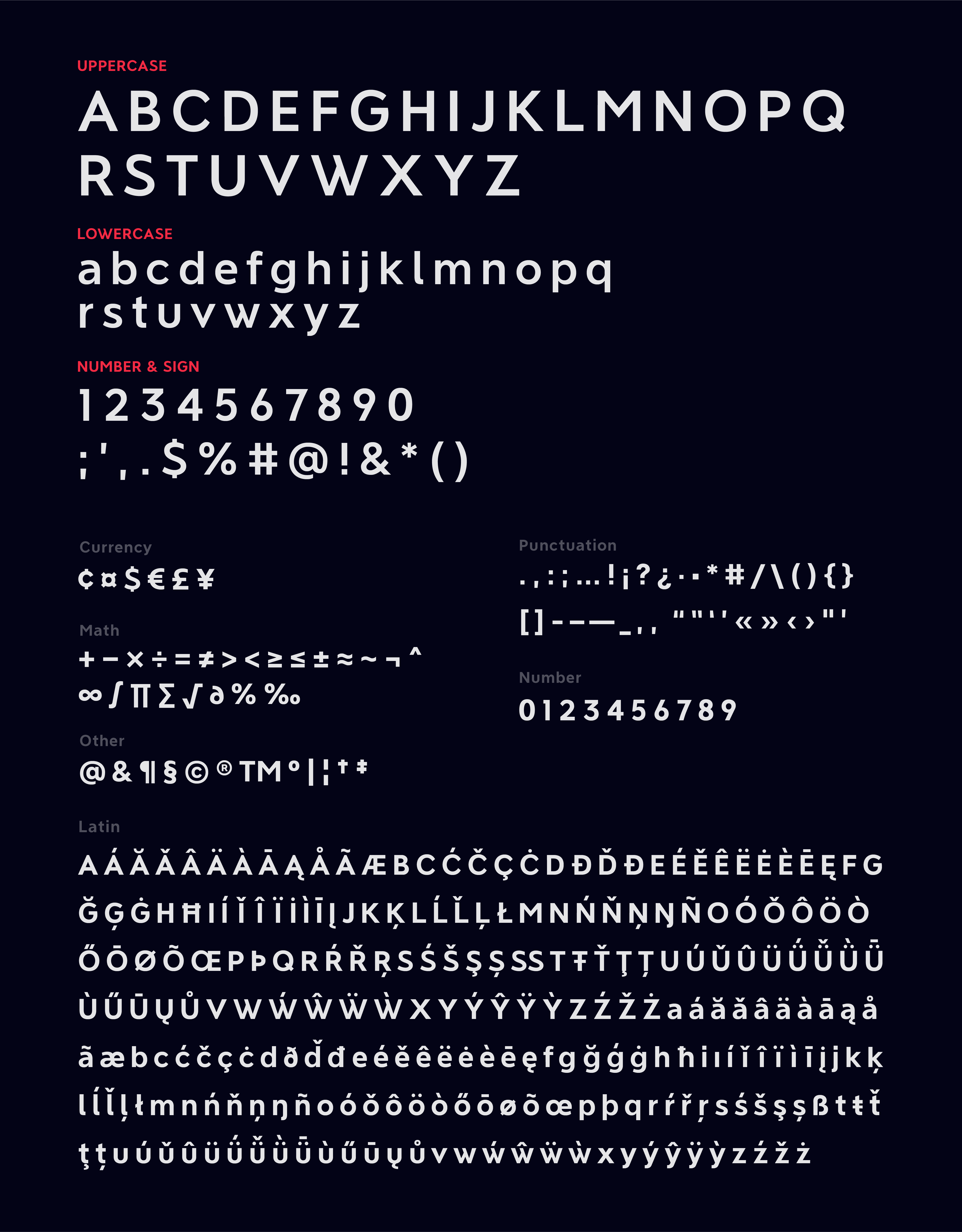
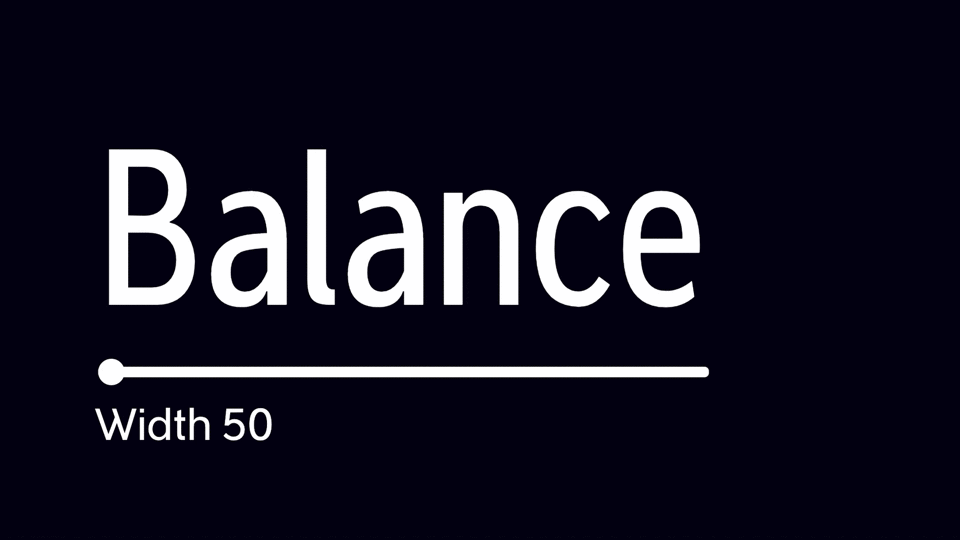
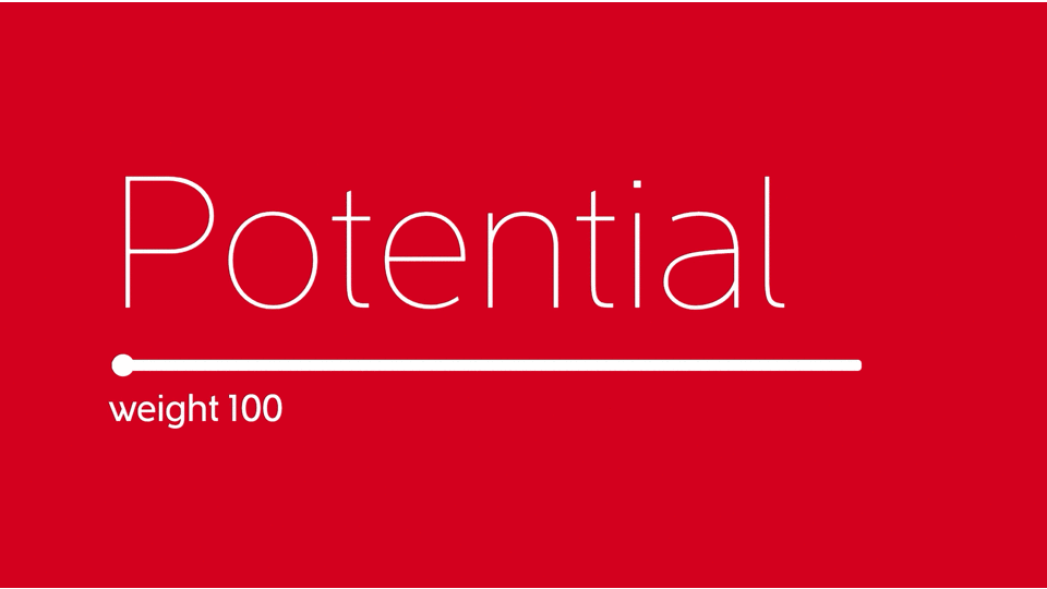
I believe aesthetic and readability coexist. There are 7 font weight and 5 width in NeverMind, from Thin 100 to Bold 700, and ExtraCondense 50 to Medicum 100 in order to cover different needs.
Readability is not about simply binding beautiful characters together, but grasp the general feeling is more important than proposing a single font.
Different scenes, multiple screens and various audience require concise layout for better and clearer display, and that’s why we customize the negative space to release a compact NeverMind - narrower letters with smaller margins based on the basis for comfortable reading experience.
That's why we use Medium on the central topic on the official website, while SemiCondense is selected for content for better reading experience.
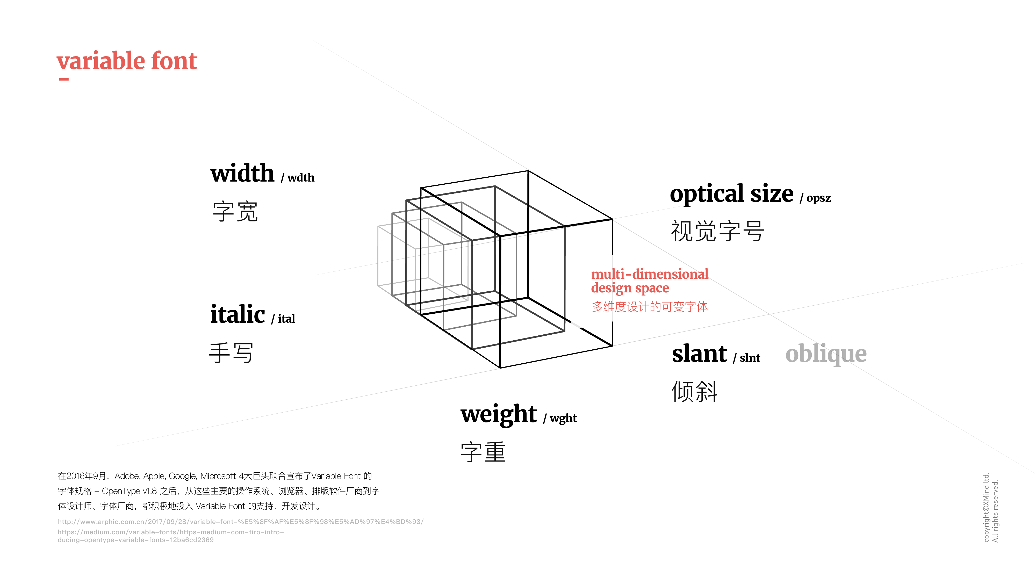
Variable Font Means Possibilities
NeverMind is dynamic and can be transformed. You can create multi-axes design space by defining variations within the font.
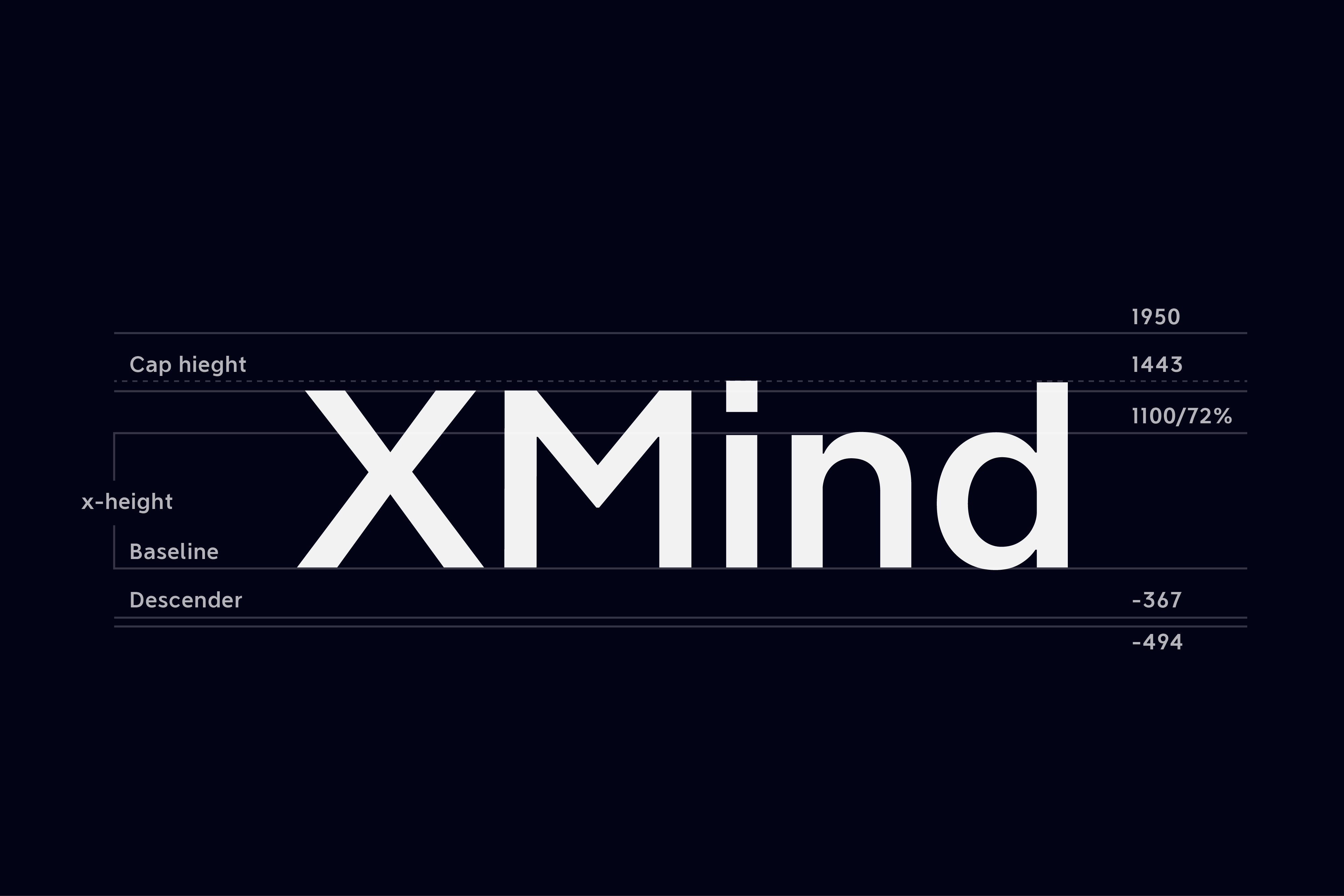
The variation of NeverMind is optimized in several dimensions, for example, the higher x-height is exclusively optimized for display and small characters so that the fonts can be well displayed in different font weight, font width, and font height with helping hands from 9 different weight change.
The ultimate consequence is that the font can be adjusted in any way you want, like the Elastigirl in the Incredibles, change to meet different scene without boundary.
What are the challenges and how did you overcome with it?
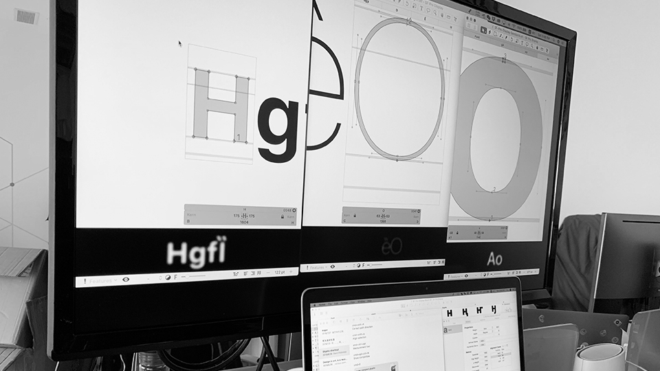
There are 4 parts in the fonts design: Research; Pilot Design; Tooling and Result.
A good beginning is half success, and the beginning is always a hard bone, because you’ve got to know the discipline in-depth before the next move.
The 5 axes for fonts designing takes me time to digest, so that I can apply them into the design.
Font design is both graphical and rational. The arts of balancing takes time and patience during this journey, you have to collide and find the balance between rationality and sensibility, logic and graphics, geometry and humanism, functionality and aesthetic. Of course, repeat and think again and again until reaching the golden point.
Though a bit challenged, I did enjoy the feeling of improving as I proceed closer to NeverMind.
What are the next moves?
The font is running on XMind website now, and will be displayed on more coming projects or items. We will also release it on Google Fonts for XMind users and fonts lovers.
With the development of image ology, update and optimization are definitely on the roadmap.
Where did you collect the inspiration? What was in your mind when designing?
Frutiger and Gill Sans are my muses. I favor font that brings the best reading experience for readers. It’s subtle but filled with the personality that is just right.
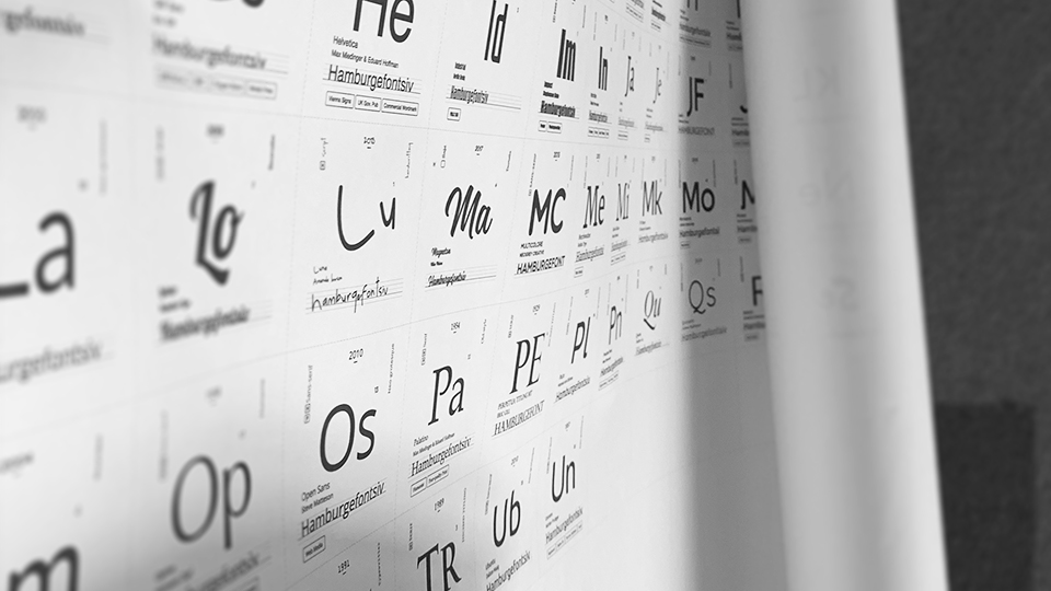
To be honest, I used to divide fonts into 2 categories: Serif, and those aren’t, until I made my very first research on 300 fonts. I was enchanted and impressed with these vibrant characters and became font-sensitive. Daily observation on fonts appearing in life, such as public transportation, cities, or
Most of the fonts were born in the cafe, because I enjoy working and thinking in a lousy environment where I could find my inner peace easily. I was drenched in designing, so I guess my mind was occupied with variable fonts combination.
What’s your favourite font and why?
My personal favourite is San Francisco, though not blows you away at first sight, instead, it optimizes each and every font after observe them closely. It also inspires me when designing NeverMind. You can hardly realize its existence on the screen display. For me, the best font is hardly noticed yet right for current scenario.
Suggestion for the designers?
I'd rather say my personal feeling, instead of suggestions. Keep learning, especially the fonts :)
I recently read about multi-potentiality, that is a person with different interests and creative pursuits in life, while excel in different fields.
Multi-potentiality can make your design different. You can come up with ways of balancing and get a diverse general perspective when knowing what are the options out there. I don’t limit myself, no matter working on branding, UI, industrial, or the font, I’d rather think and try to manoeuvre them.
Try Xmind Free-
Why do we create NeverMind?
What do you want to convey with the font?
What makes NeverMind unique?
What are the challenges and how did you overcome with it?
What are the next moves?
Where did you collect the inspiration? What was in your mind when designing?
What’s your favourite font and why?
Suggestion for the designers?
Try Xmind Free